Google is rumoured to be testing a new Gmail interface in order to make the email app more user friendly.
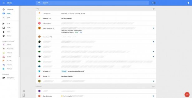
Leaked screen shots revealed Google’s new plan to revamp the Gmail interface, making it look more like Google+.
The layout looks to be much more simple and responsive and offers a wider main panel for recent emails.
The new design also shows that the left and right fixed side panels have been removed and replaced with collapsible menus, allowing users to view different options.
The left side of the screen still houses the Hangouts and chat options but also includes a reminder option which allows users to store unfinished emails or notes.
On the right side it appears that an “Upcoming” section has been introduced along with a new pin system, very similar to the new design that was launched on Gmail for Android devices.
While Google is yet to comment on the new Gmail improvements, it does appear that the new interface could be rolled out as soon as June.
